


One More Shot | Branding
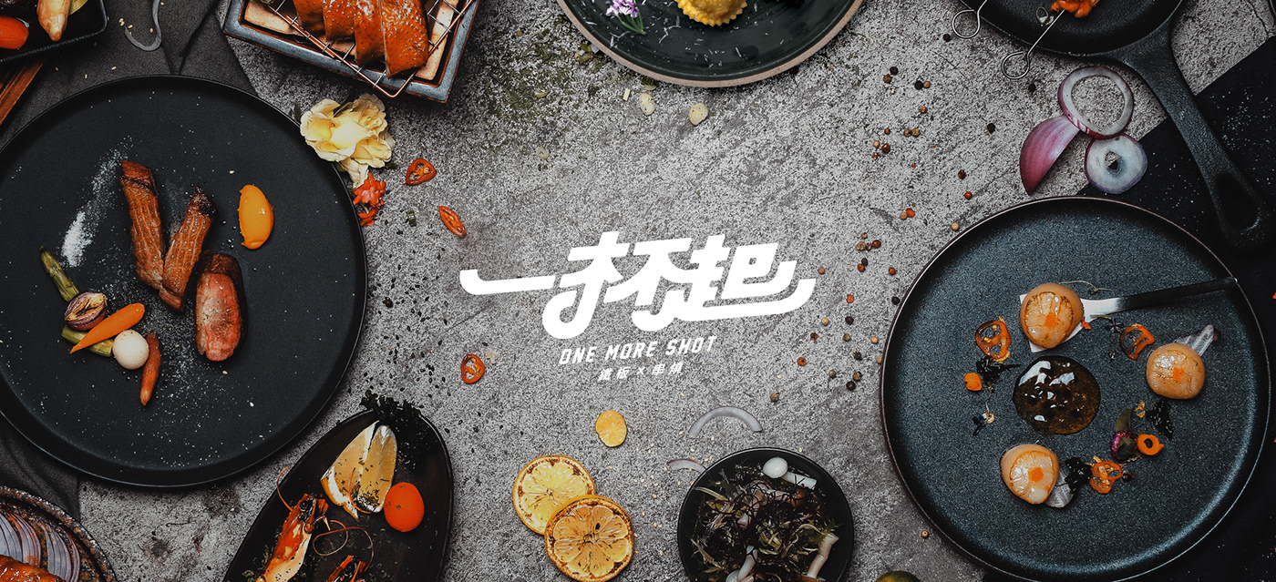
Located in the Eastern District of Taipei, “One More Shot” provides teppanyaki, kushiyaki, and alcoholic beverages. It is a quiet space in the bustling city. With an industrial-style design, “One More Shot” creates a warm and welcoming place for alcohol enthusiasts.
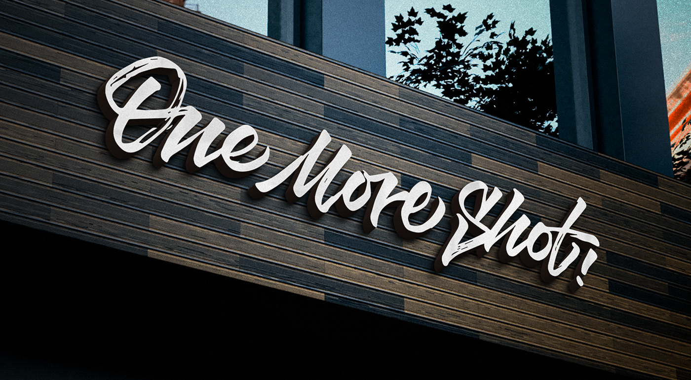
The logo of "One More Shot" is designed with rounded strokes, just like friends, going to parties hand in hand, eating food and drinking beer casually. The color palette uses a warm brick orange to emphasize the owner's passion for food; paired with black and white to add a sense of style to the brand. Additional graphic elements combine the restaurant’s three main features: teppanyaki, kushiyaki, and alcoholic beverages into icons. One More Shot is a space where delicious food and tasty drinks come together.


Credits
Type|Branding
Year|2020
Year|2020
Client|One More Shot 一杯起_鐵板x串燒
Agency|PRISM Co., Ltd.
Art Director|Noodlemaker
Project Manager|Sarah Peng/Grape Chiu
Photographer / Videographer| HOW CHAN Photography
Design Director|Si Jia Sun
Typography Designer|Si Jia Sun
Visual System Designer|Si Jia Sun/Tai Jiang Lin
Portfolio Designer|Si Jia Sun


